Our Brand
NEVER CEASE OUR PACE TO INNOVATE

We are always pushing the boundaries of technology, exploring deeply and infinitely, to constantly create new possibilities. In this world of interconnectivity and security, we are committed to empowering new & secure living experiences for every individual and working with our partners with shared values.

Meet the New “D”
Combined “D” with the shape of Wi-Fi represents DNAKE’s belief to embrace and explore interconnectivity with a brand-new identity. The opening design of the letter “D” stands for openness, inclusiveness, and our resolution of world-embracing. In addition, the arc of the “D” looks like open arms to welcome worldwide partners for mutually beneficial cooperation.
Better, Simpler, Stronger
The fonts that go with the logo are the serif with the characteristics of being simple and strong. We try to keep the core identity elements unchanged while simplifying and using modern design language, nurturing our brand towards future-oriented perspectives, and deepening our brand strengths.
Vigorous of Orange
DNAKE orange symbolizes vibrancy and creativity. This energetic and powerful color well matched the spirit of the company culture which is keeping innovation to lead the industry development and create a more connected world.

DNAKE offers a full and comprehensive portfolio of video intercoms with multi-series solutions to meet various project needs. Premium IP-based products, 2-wire products, and wireless doorbells greatly improve the communication experience between people, empowering easy and smart life.

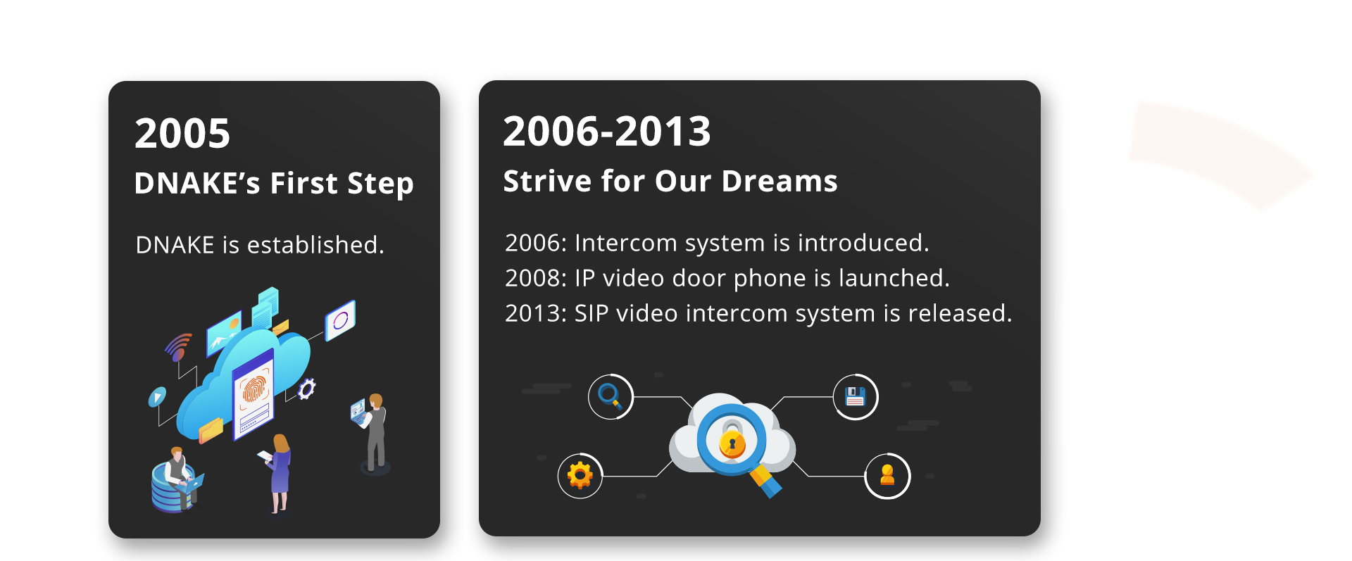
DNAKE MILESTONE
OUR WAY TO THE NEW POSSIBILITIES